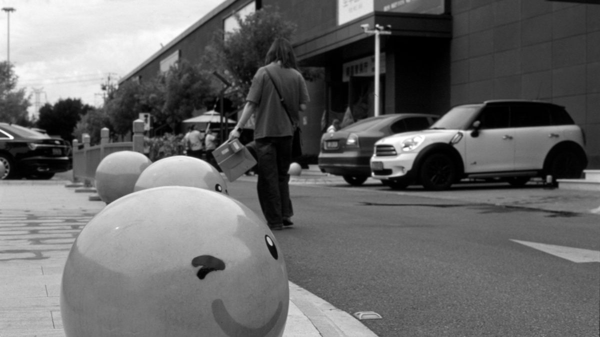
The Power of Empty Space
Whitespace — also known as “negative space” — is one of the most underrated tools in UI design. It’s not wasted space. It’s not “blank.” It’s breathing room, and your... Continue reading

Whitespace — also known as “negative space” — is one of the most underrated tools in UI design. It’s not wasted space. It’s not “blank.” It’s breathing room, and your... Continue reading

When users take action, your interface should respond. A pressed button, a saved setting, a completed upload — every event needs feedback. Without it, users feel uncertain or even frustrated.... Continue reading

Design decisions shouldn’t be made purely by intuition or internal opinion. What feels “right” in Figma might fail in front of real users. The best designers get curious, test often,... Continue reading

Microcopy — those tiny bits of text in buttons, forms, and error messages — shape how users feel about your product. Good microcopy is clear, human, and helpful. It can... Continue reading

Ever tapped a button and saw it bounce slightly? Or pulled to refresh and got a satisfying loading animation? Those tiny, often subconscious design touches are called microinteractions — and... Continue reading

Dark mode isn’t just a trend anymore — it’s an expectation. Users now switch between light and dark themes depending on the time of day, their environment, or just personal... Continue reading