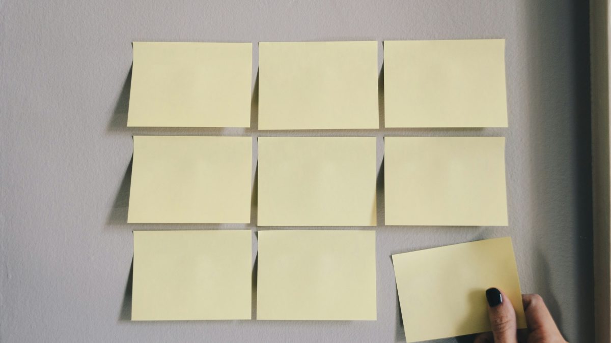
The Power of Empty Space
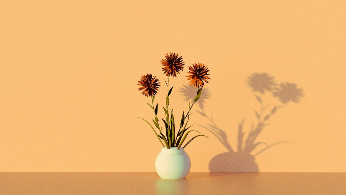
Whitespace — also known as “negative space” — is one of the most underrated tools in UI design. It’s not wasted space. It’s not “blank.” It’s breathing room, and your... Continue reading
6 Articles
Whitespace — also known as “negative space” — is one of the most underrated tools in UI design. It’s not wasted space. It’s not “blank.” It’s breathing room, and your... Continue reading
Microcopy — those tiny bits of text in buttons, forms, and error messages — shape how users feel about your product. Good microcopy is clear, human, and helpful. It can... Continue reading
Ever tapped a button and saw it bounce slightly? Or pulled to refresh and got a satisfying loading animation? Those tiny, often subconscious design touches are called microinteractions — and... Continue reading
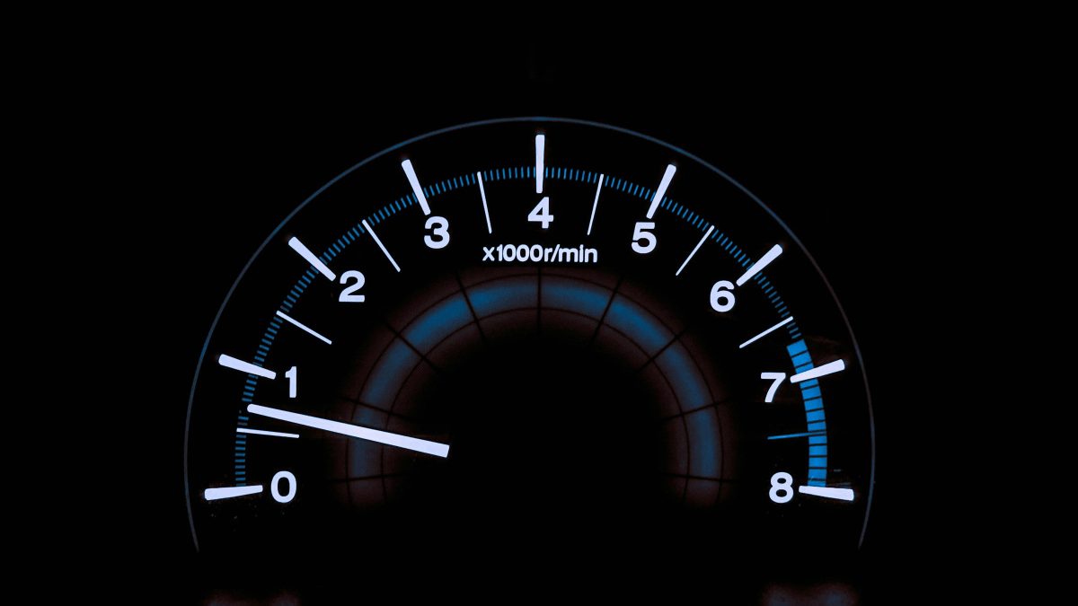
We often obsess over layout and color, but users judge your interface in milliseconds. If your site feels slow, it is slow — in their minds. Speed isn’t just a... Continue reading
Flashy designs win awards. Boring ones win users. Most of the time, users don’t want surprises — they want to complete a task and move on. Familiar patterns, clear layout,... Continue reading

Animation makes good UI feel alive — but only if the core layout works first. If you’re animating before your spacing, hierarchy, and flow are solid, you’re polishing a shaky... Continue reading